RELEASE INFORMATION
15 MARCH 2021
369.99 USD
RAW TITANIUM
50 MADE
DIAMETER 56MM, WIDTH 42MM, GAP 4.4MM
65.8G
M4 x 8mm axle
CONCAVE D bearing
D SIZED TYPE 50 LANDING PADS RESPONSE


BORN CRUCIAL
I have known Paul Yath for about 6 years. We were introduced by a mutual friend, Robb Weinstock, a respected magician and a genius copywriter (he wrote a few of the marketing copies on the RSO site). Before I knew Paul, I had already been collecting yo-yos from Born Crucial, most notably the Milk. The Milk is probably the most aptly named yo-yo ever - it's made up of milky white Delrin and comes in a milk carton. My favorite has to be the Milk 2% with its SPR system. Remember the nutrition label with the yo-yo specifications? The Born Crucial branding was unparalleled when it started and remains relevant today. Up till today, no one has done it like Paul. Today, the brand is known simply by the name Crucial.
Crucial has significantly influenced RSO’s design philosophy. I constantly try to incorporate yo-yo elements into everyday objects - the Bowl restaurant receipt, the Bowl Mini birth certificate, and the transforming Doombot, just to name a few. These yo-yo elements give the yo-yos an identity that makes each model stand out from other releases.
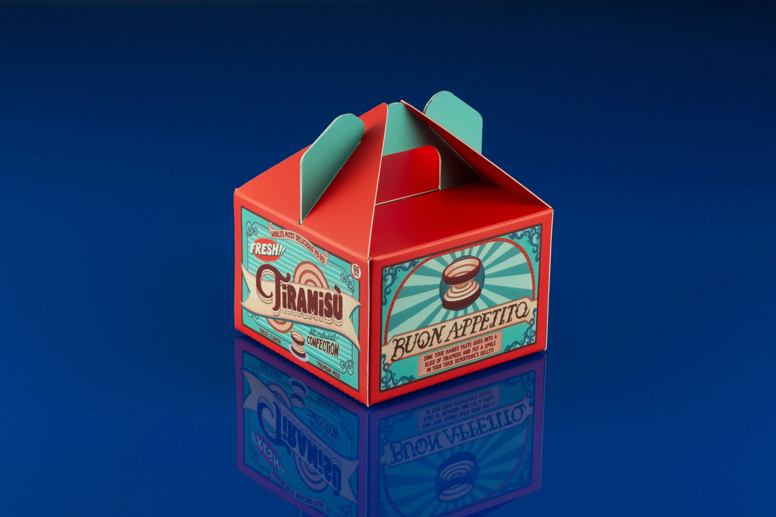
Paul had been on a break from the yo-yo scene for a while but briefly returned with the Fresh Milk, Butter Milk, and most recently the Smoothie in 2017. He also got married! There have been constant calls for his return. In June 2020, with Robb's help, I managed to persuade Paul to work on something with RSO. Paul had initially wanted to work on a titanium Milk, but… let's save that for later. Besides, I was hoping to do some fresh designs for the start of 2021. After a brief brainstorming session, we unanimously agreed on the name TiRAMiSU, which reflects the titanium material of the yo-yo and fits in with the rest of the Crucial lineup which has food names.

THE SECRET RECIPE

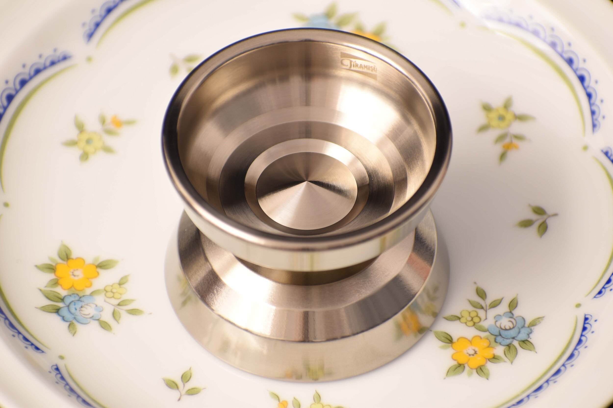
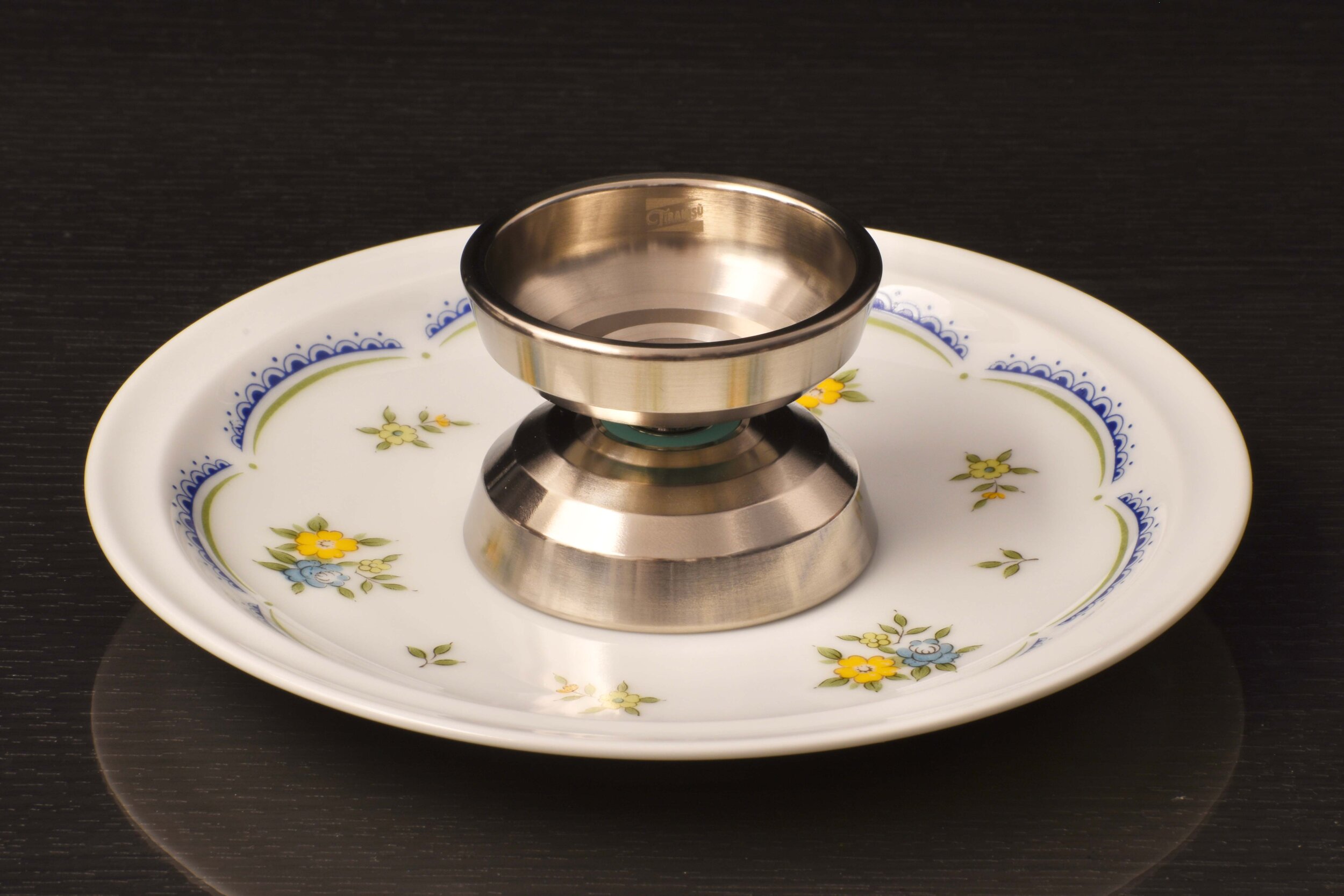
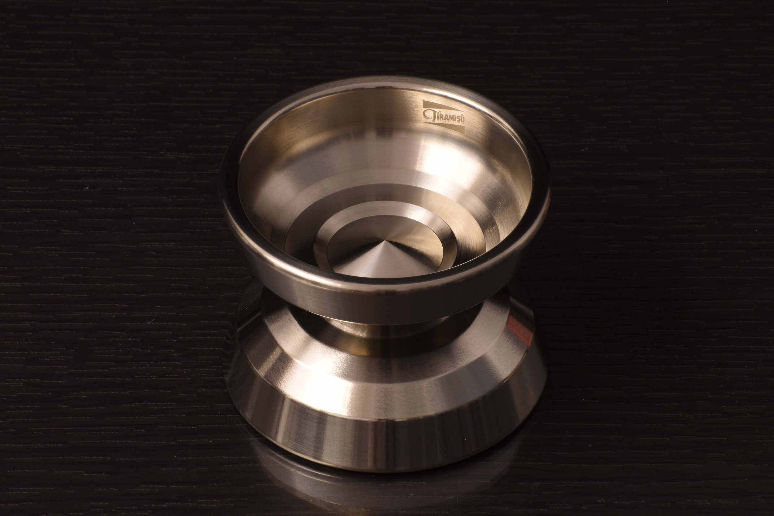
Paul had prototyped a titanium yo-yo years ago, which had a catch zone with a series of steps. This design aesthetic has been popularized by companies such as Turning Point and UNPRLD. Another yo-yo that looks gorgeous with this aesthetic is the ILoveYoYo 3145. We felt that because a Tiramisu dessert typically consists of many layers, the steps on the catch zone fit the TiRAMiSU theme perfectly.
We had a huge problem. Paul did not have the yo-yo with him anymore and had misplaced the CAD file for it. He dug out two pictures from his archives which only showed the catch zone without the hub. We had to go back to the drawing board.


Both Paul and I decided to start off with our own interpretations of TiRAMiSU (you can see our designs below). Paul's CAD takes a lot of inspiration from his most recent release, the Smoothie, with the hub's many concentric circles. My version had fewer lines in the hub and had an angular nipple inspired by the Jirorian. We ultimately chose to use the CAD I drew as the starting point for the prototype.

Crucial Smoothie

Born Crucial Jirorian

CAD by Paul Yath

CAD by Elvin Lim
Once we tied down the look of the yo-yo, we proceeded to work on its weight distribution. Both our initial designs severely lacked rim weight. Paul had also felt his initial prototype was too center-weighted. I managed to change the design and push more weight to the rims while not altering the yo-yo's external appearance significantly. The rims on the TiRAMiSU are inspired by the Turning Point Mustang.


THE PROTOTYPES
We wanted the TiRAMiSU to be a D bearing yo-yo from the beginning. It would be the first D bearing titanium yo-yo on the market. Response pads were no longer an issue after I had D bearing Landing Pads made. I was new to D bearings at that time (this project was conceived before the D bearing Bowl Mini) but was keen to experiment with how a D bearing titanium yo-yo would play. Despite the astronomical cost of prototyping, we had both D and C bearing prototypes made.

D bearing (left, with Turquoise D bearing Landing Pads) and C bearing (right, with maroon Type 40 19mm Landing Pads) TiRAMiSU prototypes.
There wasn’t a clear winner after we received the prototypes.
On my first throw of both prototypes, I preferred the D bearing version. It felt extra special - it had a lot more power than the C bearing version, but did not have the kickback expected of a D bearing yo-yo. Given the amount of rim weight we added to the design, we were lucky not to introduce intolerable kickback.
On occasions when I threw the C bearing version, I preferred it to the D bearing version because it had more float. We were torn between both versions even after months of playing them extensively. They would cater to different sets of players.
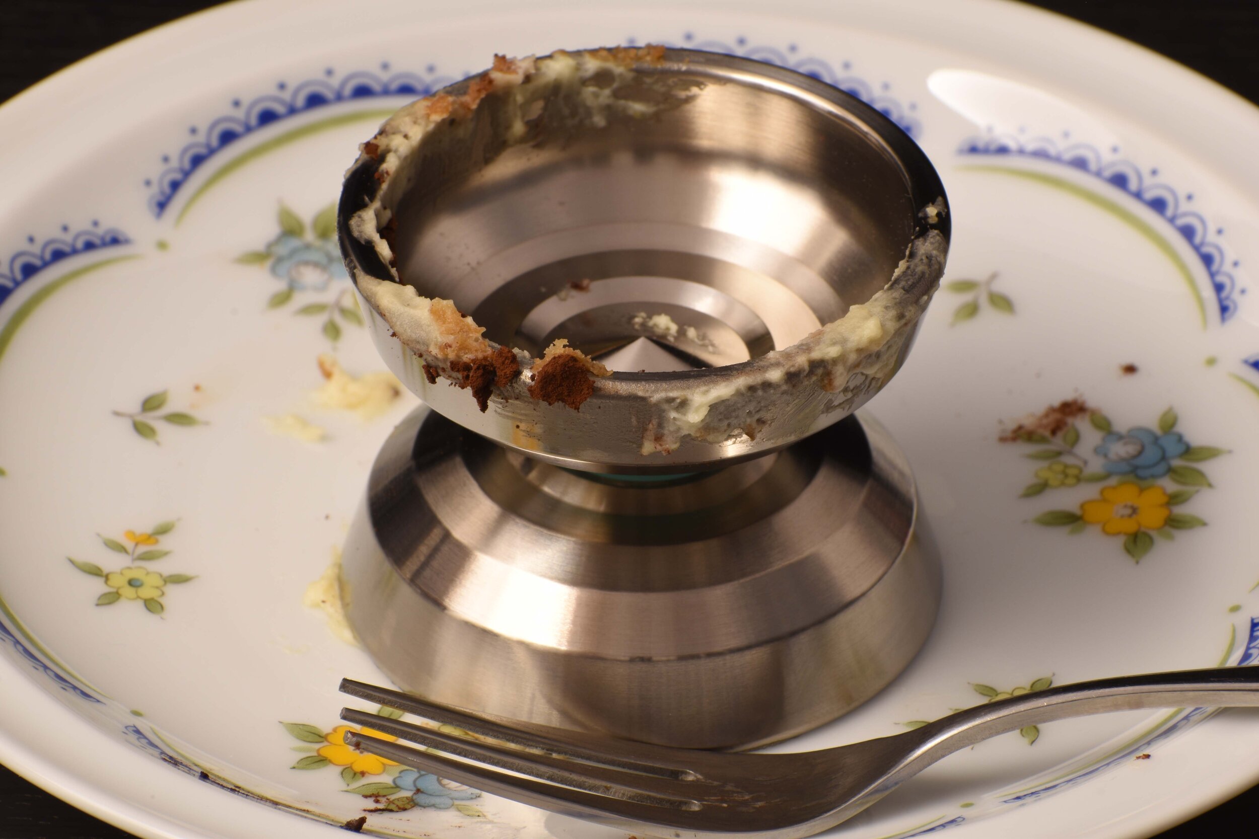
We ultimately decided to put the D bearing version into production. Subtle changes were made to the steps. We felt the prototype’s steps looked too angular and felt sharp in the hand, so we smoothed them out slightly.
I was unsure about how the production run would turn out, given that this was my first D bearing design. We made a conservative order of 50 yo-yos, which, in retrospect, was a bad decision. The production run turned out perfect and there was an overwhelming demand during the pre-order. Perhaps we should do a run of the C bearing version?


A picture of the TiRAMiSU prototypes Paul sent me. We both tested the C and D bearing prototypes extensively for a few months.
MAKING IT LOOK DELICIOUS
How I approached the artwork and packaging for the TiRAMiSU was significantly different from my previous projects, which typically had RSO in full control of the artwork and packaging from start to finish. Given Paul’s expertise, I felt it was better that he took the lead. The draft of the artwork was done by Connor Ebbinghouse, a good friend of Paul’s, who also did the superb artwork for the Fresh Milk.
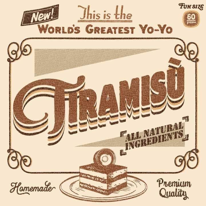
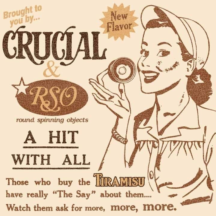
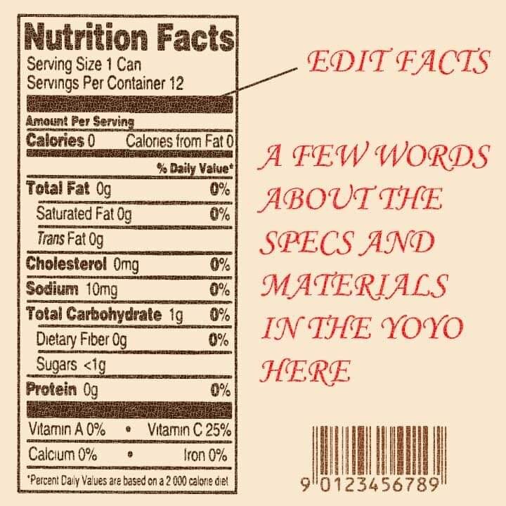
RSO then did the rest of the work. The artwork was done by ATILA, a long-time collaborator of ours. I was aiming for the retro feel. For the final artwork, we had to include the signature Crucial nutrition label, this time with more detailed specifications than the Crucial yo-yos of old. I also designed the cake box packaging, going through 3 prototypes before arriving at the final version.
Tip: Scan the barcode to reveal a hidden message!


CRUCIAL DENIM
Paul had been working on a denim side project with the Crucial brand and came up with the brilliant idea to make a denim pouch for TiRAMiSU. These were made in the USA, near where Paul lived. He had initially designed a square-shaped pouch but eventually made a cuter, more rounded version.


WHAT’S IN THE CAKE BOX
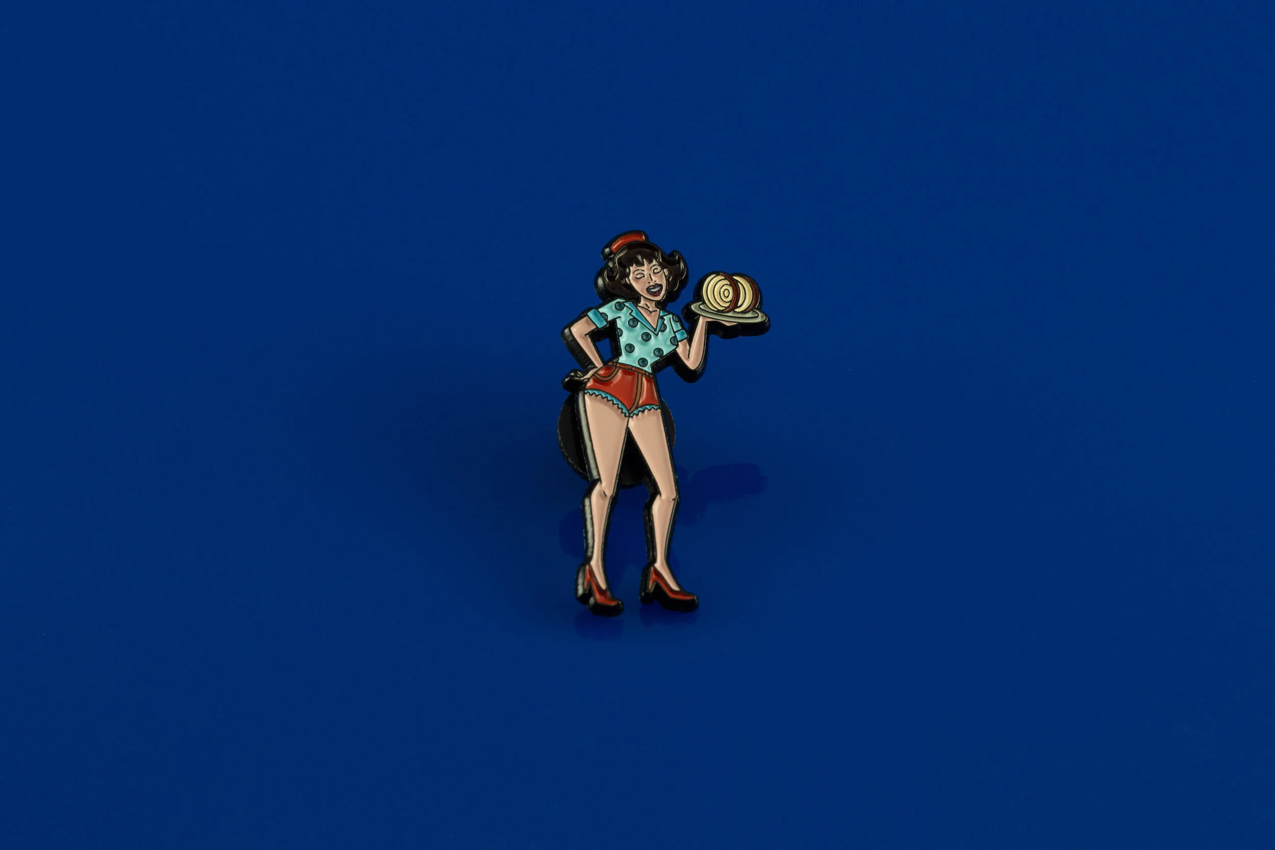
TIRAMISU WAITRESS ENAMEL PIN
DENIM POUCH
A PAIR OF D SIZED TYPE 50 RSO X YOYOLAB LANDING PADS
ORANGE THICK STRING

PHOTOS FROM A COLLECTOR
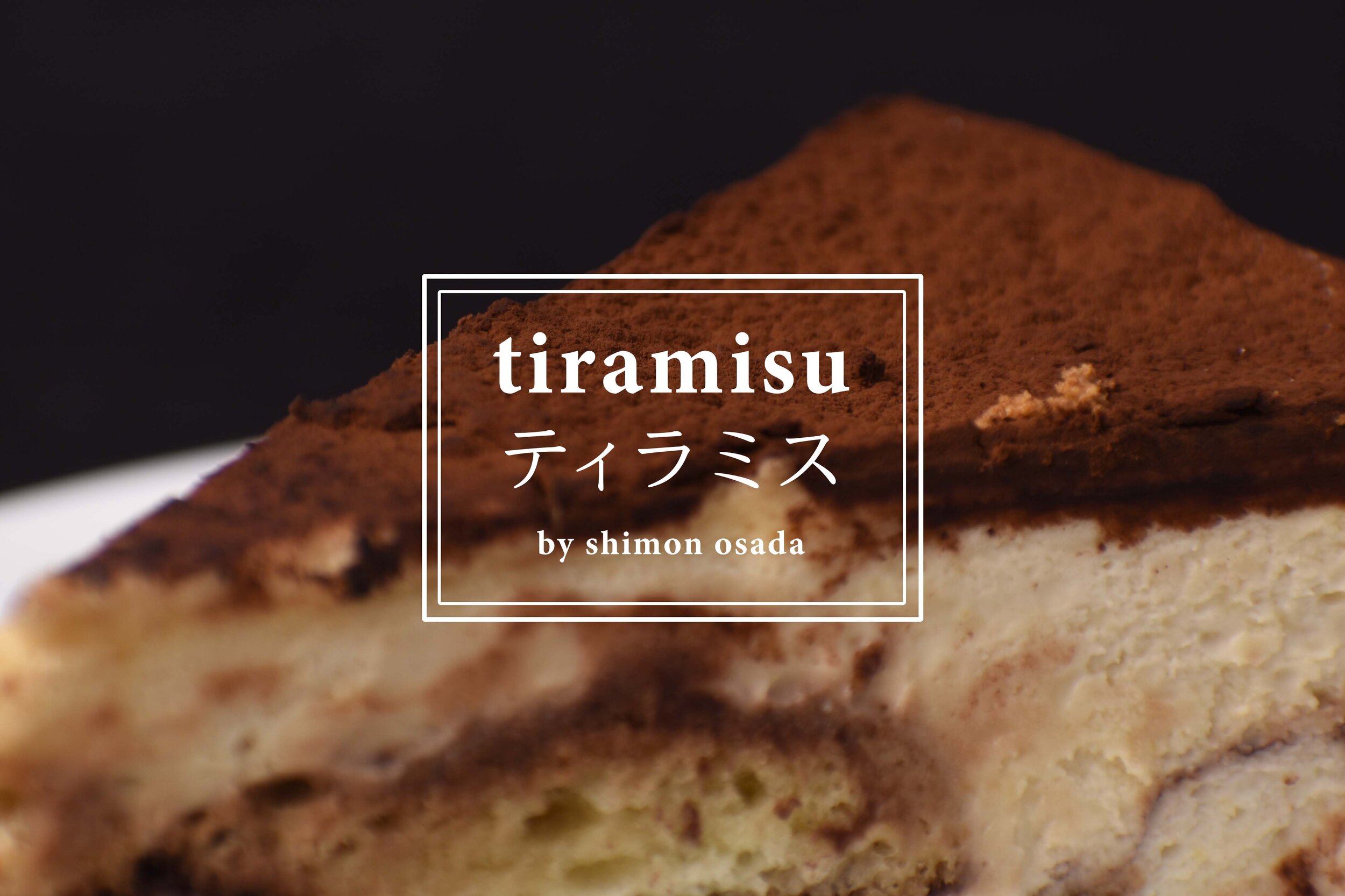
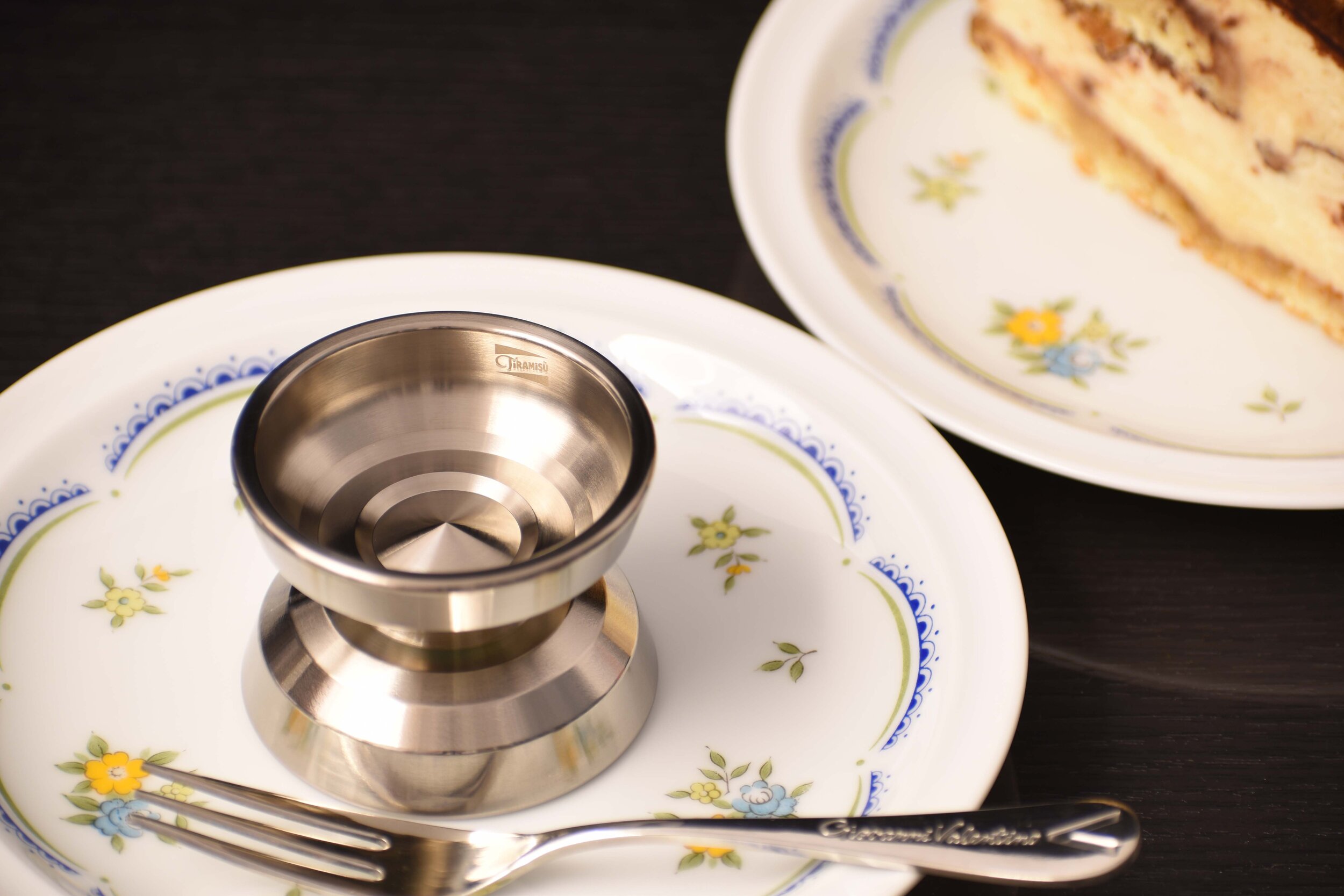
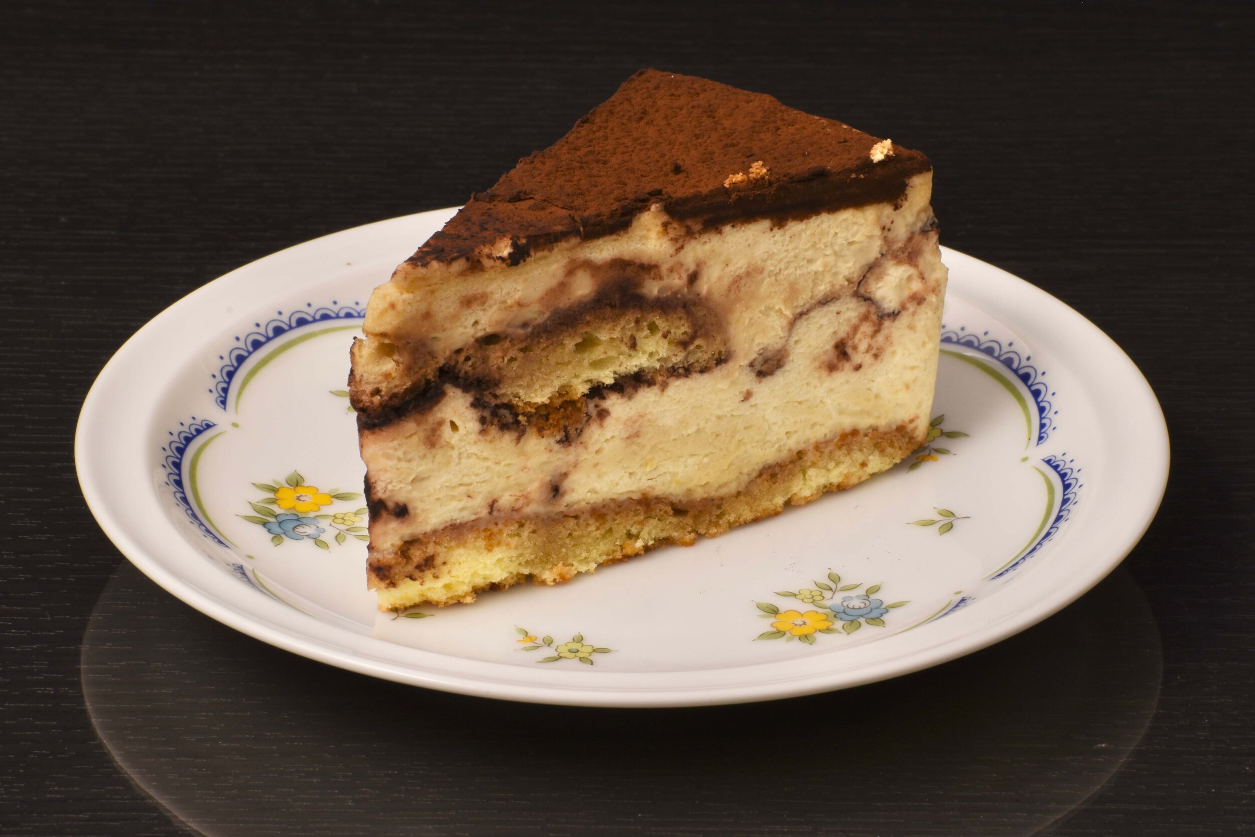
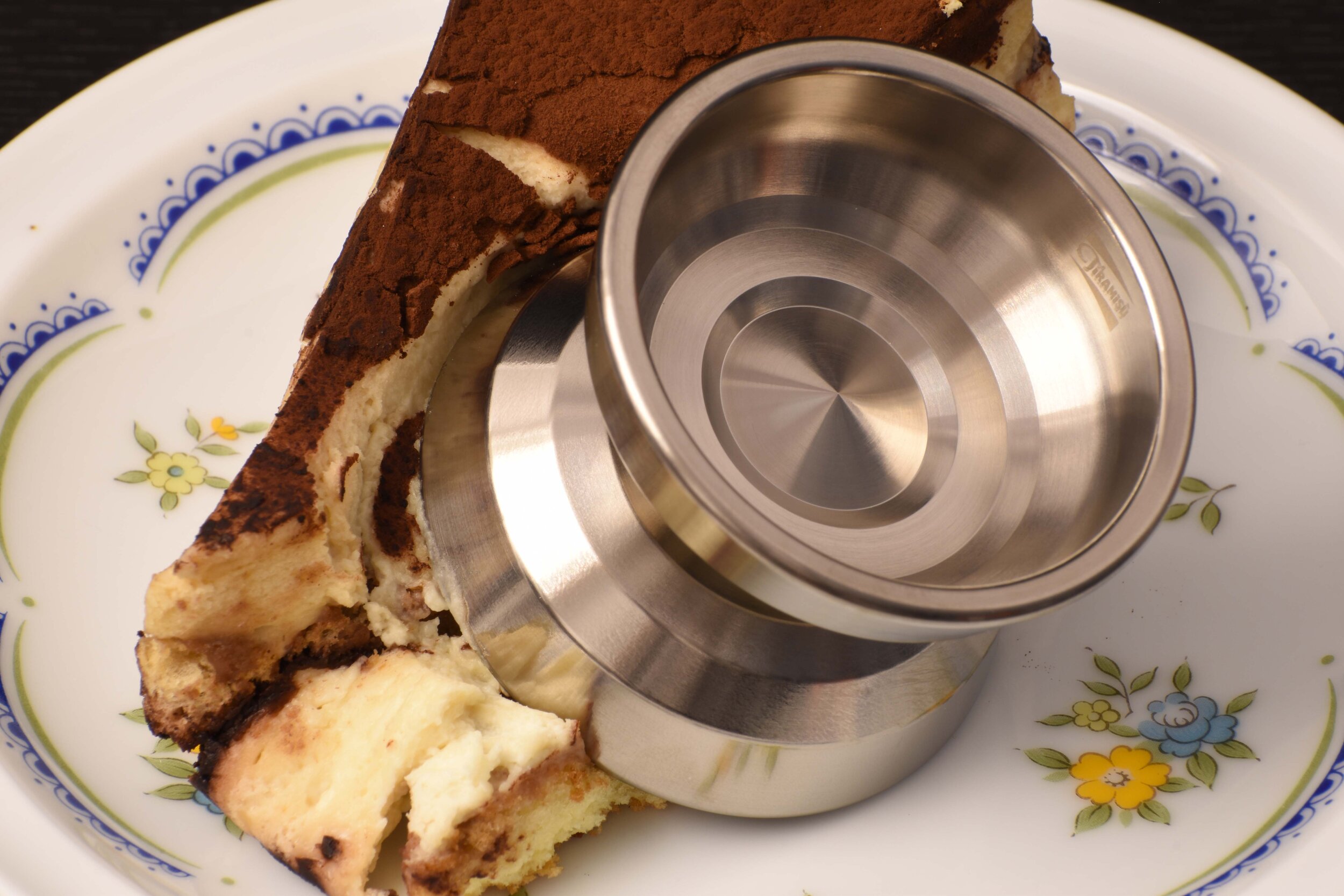
One of RSO’s most loyal collectors, Shimon Osada (@shimoff_2) from Japan, has created a gorgeous Tiramisu menu, reminiscent of the Japanese cafes I previously visited.